Wednesday, 29 November 2017

Layout ideas for Poster and Billboard

Poster Layouts

In a film poster, the title is often simplistic and short, especially in the psychological thriller genre, a shorter title means that it can take up a large proportion of the screen without being to overwhelming and confusing. The placing of the title, can be dependent on the image as it needs to be placed so that it doesn't draw attention away from the main image. Therefore, by creating sketches with more than one title location, it gives more opportunity to experiment with the images.
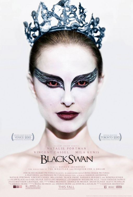
It could be argued that the film posters which create the most impact, is the ones where there isn't too much text or graphology, with the main impact being in the image. Therefore, I only used the most important features that will give the audience enough information and get their interest. 

From audience research the most popular layout sketch was found to be the 6th, this was the one of the layouts which had the least amount of informations in the middle part of the sketch. This leaves more room for the image, when taking my genre into consideration it was thought that the most important feature on the page would be the image that would need to have a longer lasting effect on the audience and convey fear, paranoia and building tension.


This is an example of typical films in the psychological thriller. It illustrates how this format has already been shown as being used for existing film in a successful way. Therefore, when planning to create my own posters, I would be more likely to pick this format and then adapt to suit my own images. This makes production easier as I already have feedback on what structure is most suited and therefore have a longer period of time for further development.

Billboard Layouts


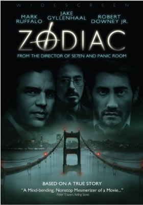
Due to the size of a billboard, it gives more room in the structure for larger fonts and information. It also means that the image used needs to be landscape, therefore, more characters can be used within the image. Similarly, there can be a larger proxemics between the characters with more room, this can give a better idea to the audience what the character relationships are. The purpose of a billboard, means that it needs to catch attention quickly, this means that image has to have a large and fast impact on the audience with the name of the film being prominent enough for the audience to remember after. The 4th and 5th layout ideas are less likely to be used for mockups at this stage because there is too much information that could potentially block parts of the image as well as distract from the title. The examples of existing billboards bellow illustrate how little information around a large image has a large impact and can be more memorable to the audience.


Layout ideas for Magazine front cover


From my foundation portfolio, I am already aware of the key conventions for a magazine. Therefore, I am able to experiment more with the format and further stretch the boundaries in a style that makes my product more unique. In all of the formats, the masthead takes up the top third of the front cover, this is because from research in both my foundation and advanced portfolio the most successful covers use this. This is important as it affects the images that I chose, as they must allow enough room for the masthead at the top of the page. However, as seen bellow in existing products, it is also a feature to have the image overlapping the masthead as it is more signifiant to the audience and therefore can't be hidden by the masthead.

Tuesday, 28 November 2017

Pitch


Our film is full of thrills, action and suspense that keeps the audience on the edge of their seats throughout. The plot twists are near impossible to guess, as the film climaxes at the end there is almost a constant level of action. It is different to films that are typically in the psychological thriller genre, there are morals and lessons that make the events and characters more meaningful to the audience. With new actors full of potential, the narrative is brought to life making the scary and disturbing moments more realistic to the audience.


It follows two teenagers as they try and reveal the stalkers identity, you see them piece together evidence while living through the traumatic events. The raw emotion and fear from the characters, make the moral of the story all the more prominent. It takes advantage of the culture for social media and technology, with the innocence and naivety of teenagers, resulting in a film that is all too real for the audience. It fulfils the conventions of this genre, further developing the traditional stalker film with new and exciting twists.

Feedback for Film Pitch

Thursday, 16 November 2017

"Creating character and characterisation"

With multiple characters in a screenplay, it is important that they feel the influence of others, and need to be respond through actions and emotions. In my narrative, this can be seen through Emma persuading Poppy for asking for help from others, she sees the potential of the stalkers identity being revealed by Poppy asking for help and then reacts by telling Poppy of the dangers.
Action details will help expand and reveal more information about the characters, without slowing the plot and taking away from the action. When Poppy notices little differences, it shows her to be quite observant and particular to detail, it doesn't take away from the action as it grows paranoia and fear in the character and audience.

To make the character feel real to the audience, empathy needs to be created, it is Poppy's breakdown and constant fear that causes the audience to feel this. In a psychological thriller, the audience can feel the victims emotions quite strongly due to the prominent emotions and triggering events, this creates a larger empathy for characters that might not be possible in other film genres. The revelation of true character is important to creating real and memorable characters who not only are driven by the story, but who drive the story and its events. In my narrative, the climax of the film is the revelation of the stalker which creates a plot twist in finding out the true identity of Emma, and how she is the antagonist of the film. A plot twist can make a film more memorable, and even cause an audience to consider watching again, in order to see if they can notice the differences that may have hinted at the characters true identity before the reveal. (Information gathered from http://www.writing-world.com/screen/film3.shtml)


Wednesday, 15 November 2017

"Common Themes in Psychological Thrillers"

One of the most common themes in a psychological thriller is obsession which can stand alone as the core of the film, such as in a stalker film, or be mixed in with other overlapping themes, such as in a revenge film. In my narrative obsession is the core theme of the film.

Here are some films which deal with the theme of obsession:

 
The obsession is different to the kind in my narrative, it is not about being obsessed with a person to the extent of being their stalker, but is about the main character feeling as if they have to achieve perfect performance in ballet. It is classed as a psychological thriller, due to the breakdown the character suffers due to the stress and the "black" and "white" swan sides of her that emerge as the film continues
 
 
This film is based around a character who becomes obsessed in finding the identity of the Zodiac killers, this is similar to my narrative in  the characters trying to find the identity of the stalker. Zodiac however, differs in the ending as the identity of the killer is never found, in the killer being unknown to the audience and character it creates a strong weariness, vulnerability and suspenseful moments which my narrative strives to create.


Ideas for film title

Title ideas by JustineA2Media


I have used Canva for these initial ideas, it has allowed me to experiment with my initial colour scheme of red, black and white. Using this software I have decided to use a sans-serif font, as the technology used in the narrative show it to be a modern film. Furthermore, this template layout has given me the opportunity to set out the ideas as if it was a screenshot from a trailer, which has given me a more in depth idea for what ideas would be more suitable and effective.

From research into film titles of the same genre, a commonly used effect was mirrored both behind and as if the words are blurring. I have converted to the convention in this title, but have also made it more unique through placing the words repeated but in different colours. This idea also links in with the dark black background, this was a convention found in all of the titles that I researched. This shows me that in a trailer this was an important convention which I should not try to change or not conform to.

When researching into film titles, Single White Female used a background as if it had been ripped out of a newspaper, this was relevant to the film as it is about the apartment listing that begins the film. This gave me the idea of presenting the title as if it was another text message coming through from the stalker. It makes it relevant to the film and if used in the trailer could be placed over images and clips, rather than needing a full black background.
Through the use of the software Sketch, I have been able to further develop the ideas with different fonts. From my initial ideas on Canva, I have decided to use the colour scheme of black, white and red, from my research black and white were the primary colours used which means it fits with the conventions. I have also used red as it has connotations of danger and pain, this gives the audience an initial idea of what the film will about and shows that there will be lots of action and drama taking place. Some of the fonts that I have selected have a black background, this is because form my work in Canva I know that having a look into what it may look like on a trailer is important and has allowed me compare a sole use of white to black. Similarly, a few of the fonts match closely with the technology side of the narrative, in reference to the anonymous texts that the characters receives, this creates the imagery of being hacked with is commonly associated with trolls and online harassment. This shows the audience what the main theme of the film is, and if placed in after a moment of action in the trailer it can give it a larger impact.
Using different fonts has showed me that in my narrative, the title needs to seem slightly broken or disfigured as it links to the nature of the film. This is similar to The Perfect Guy title which had a crack going through it.
The second font doesn't fully fit with this genre and may give the wrong impression to the audience, as if the film was an action rather than psychological thriller. Giving the wrong impression can impact on how the audience view the film, and having an effective title can make the film stand out and give it a more professional look, because if the title isn't thought to fit with the film the audience may believe that it wasn't thought about or planned. 

Feedback

Favourite:
Least Favourite:


Favourite:

Least Favourite:


Favourite:

Least Favourite:


Favourite:

Least Favourite:


Favourite:

Least Favourite:


Favourite:
Least Favourite:


Favourite:

Least Favourite:


Favourite:

Least Favourite: